Aoyama Trading Co.,Ltd.
Crafting the ideal e-commerce experience for Japan's largest men's apparel company with strong retail roots

-
01
35%UP
EC sales amount
-
02
17%UP
Rate of digital brand experience (CVR)
-
03
240%UP
Increase in experience rate linked to stores (number of online try-on reservations)
Yofuku-no-Aoyama, the biggest men's apparel company in Japan with stores in all 47 prefectures, entrusted TAM with their E-Commerce (EC) renewal project. Our challenge? To create an online shopping experience that rivals in-store visits and leverages the extensive store network's strengths, like test-fitting and reservation services. We also aimed to communicate the brand's dedication to design and quality that sets it apart from "mass retailers." Our goal was to enhance the brand site's role in conveying quality and make the e-commerce site an integral part of the digital and real-world shopping journey, ultimately boosting Yofuku-no-Aoyama's sales through a rebranded purchasing experience centered on UI and functional enhancements.

A redesign that boldly conveys product quality
At the project's inception, we engaged in extensive interviews with members of Aoyama's product department, individuals intimately acquainted with Aoyama's suits. Their insights revealed a meticulous approach to product design, which isn't centered on high-end or high-fashion concepts but prioritizes suitability for work attire. It takes into account careful considerations regarding fabric and tailoring for everyday wear. However, the previous e-commerce approach tended to overshadow these exceptional qualities with an excessive emphasis on sale prices and information. The innate confidence in the products became obscured by an over-designed push for purchases. Aoyama's e-commerce platform isn't merely a means to purchase suits; it also stands as the singular website capable of conveying the brand's inherent allure, serving as the closest connection point for users. Throughout the renewal process, we placed great emphasis on striking a balance between e-commerce with a purchasing objective and a brand site devoted to conveying commitment. Our focus was on crafting a design characterized by spaciousness and a dignified "white" theme, heightening pride in the artistry of clothing craftsmanship.
Aoyama's e-commerce is not just a platform for purchasing suits; it is also the sole website that can convey the brand's inherent charm and serves as the closest point of contact for users. In the renewal process, we placed importance on striking a balance between e-commerce with a purchasing purpose and a brand site that conveys dedication. We focused on creating a design with spaciousness and a dignified "white" theme to enhance the pride in the art of clothing craftsmanship.
Harnessing user-centric analysis for a purchase journey seamlessly integrated with physical stores
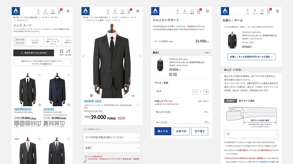
However, even after successfully conveying confidence in the products, if the flow leading to purchases is not smartly designed, it won't translate into increased sales. In this project, we revisited the purchase flow by combining TAM's accumulated knowledge and experience in e-commerce with the perspective of UI/UX design specialists. Our goal was to create an Aoyama-like e-commerce experience from a user-centric standpoint.
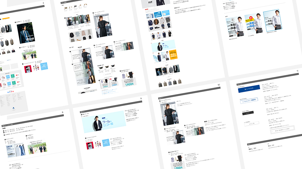
Simply instilling trust in the products alone would not translate into increased sales unless the purchasing journey is intelligently designed. In this project, we reexamined the purchase process, amalgamating TAM's extensive knowledge and e-commerce expertise with the insights of UI/UX design specialists, all from a user-centric perspective. One notable enhancement pertained to product selection. We carefully considered image sizes for suit selection and bolstered filtering options, ensuring that users could effortlessly select their preferred attire from the extensive product catalog. Additionally, a unique challenge within Aoyama's store network was the lack of clarity regarding the distinctions between the "reservation" and "test-fitting" services, which hindered their effective utilization. To address this, we provided clear explanations of the benefits and limitations of each service, along with their respective workflows. Furthermore, to ensure a seamless transition for users from consideration to purchase, we established a comprehensive design system that maintained uniformity throughout the website, spanning from banners to the overall user interface (UI). Additionally, we provided a manual to guarantee that design consistency would endure even amidst changes in personnel, all with the aim of safeguarding our brand identity for Aoyama.
CREDIT
-
CLIENT
Aoyama Trading Co.,Ltd.
-
SERVICE
-
WEB SITE


Feel free to contact us at any time.
Thank you for your interest in TAM.
Would you like to join our diverse team of highly specialized members in a collaborative project?
For inquiries and questions, please don't hesitate to get in touch with us here.

